Dashboards
Discover signals by viewing tracked Columns, Segments, and Metrics.
Dashboards are collections of histograms, time series and statistics of monitored Columns, tracked Segments, and generated Metrics for user-driven analysis.
There are three default dashboards for each Project:
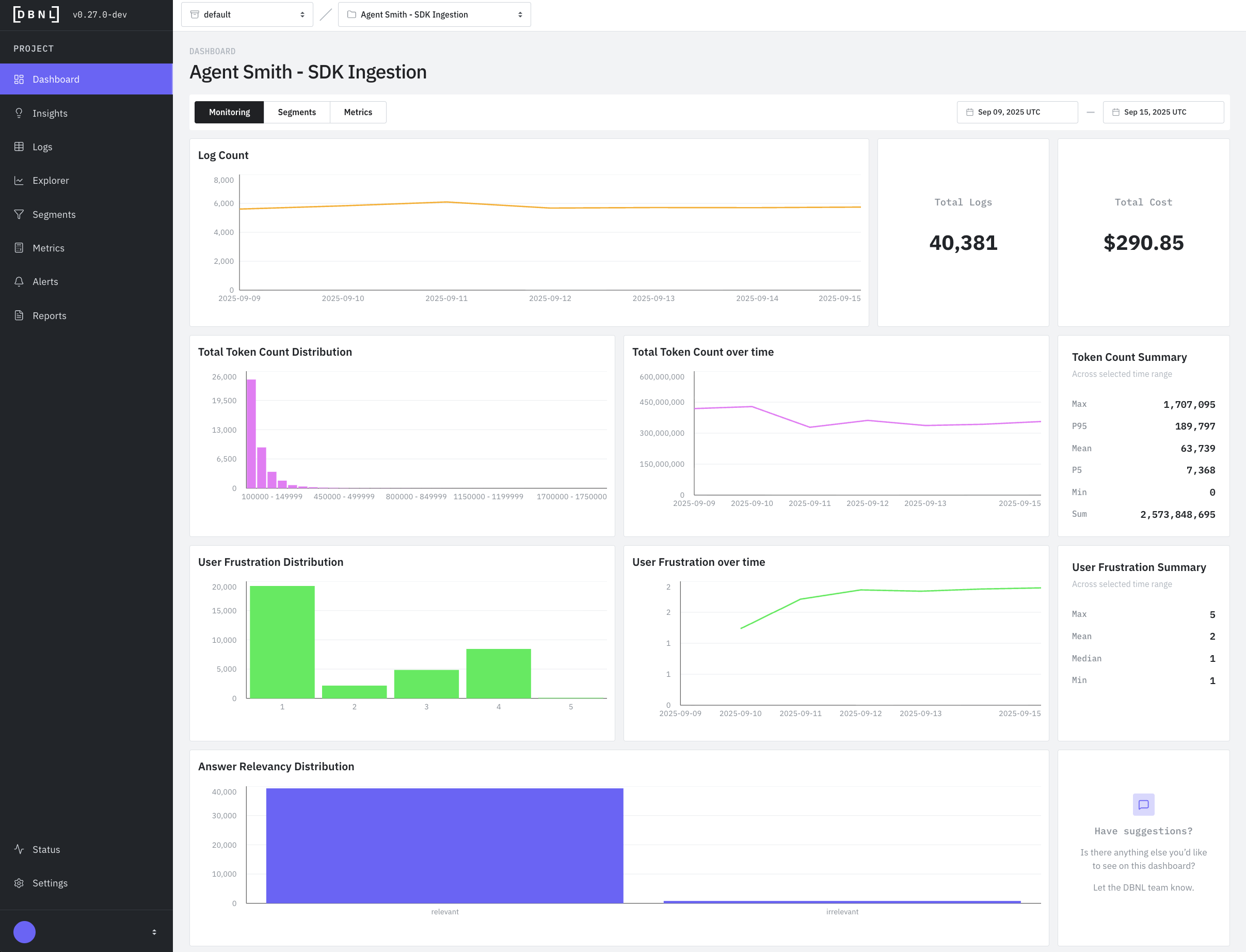
Monitoring Dashboard: Distributional recommended graphs and statistics built from required Columns and data from the DBNL Semantic Convention
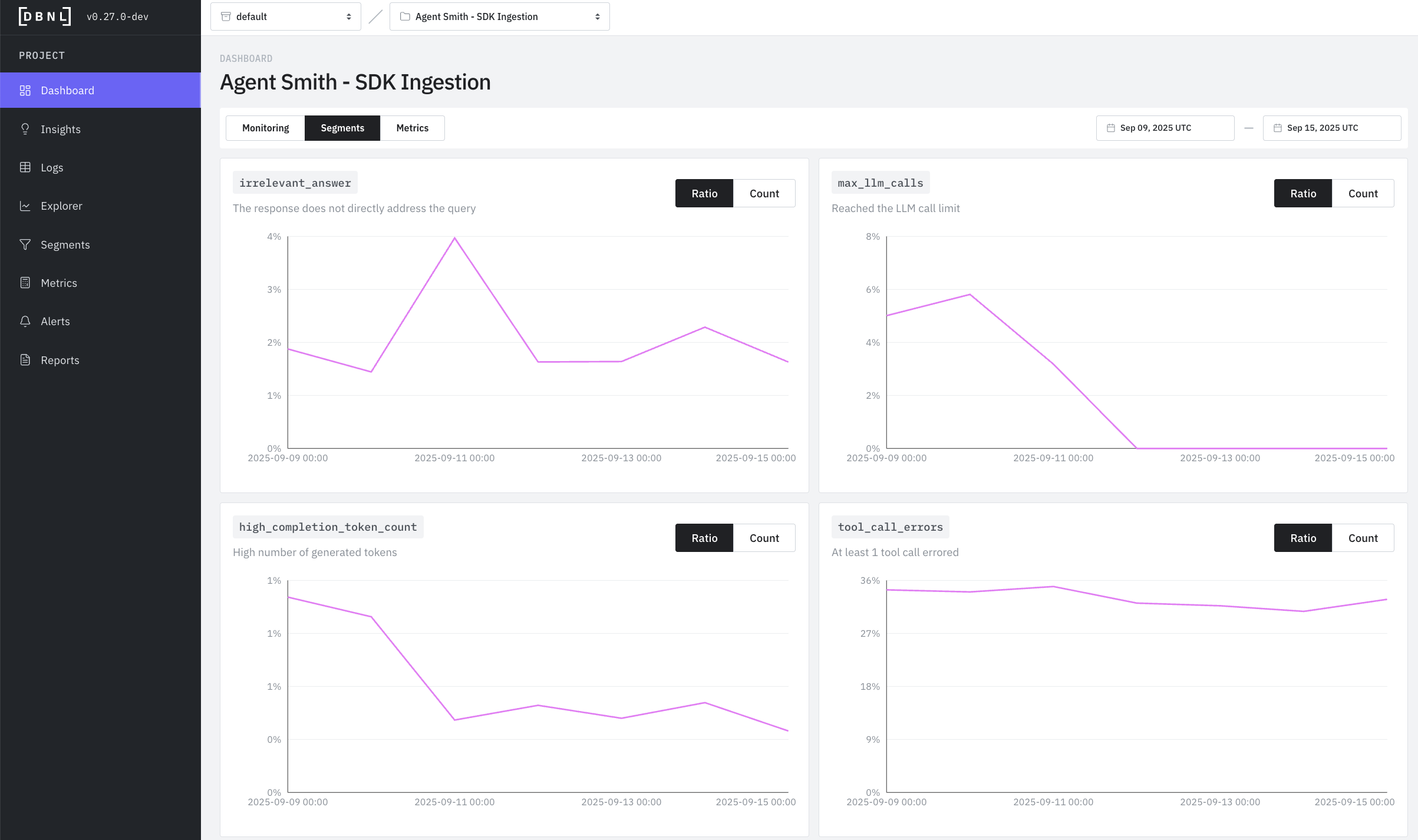
Segments Dashboard: Count graphs and statistics for all tracked Segments
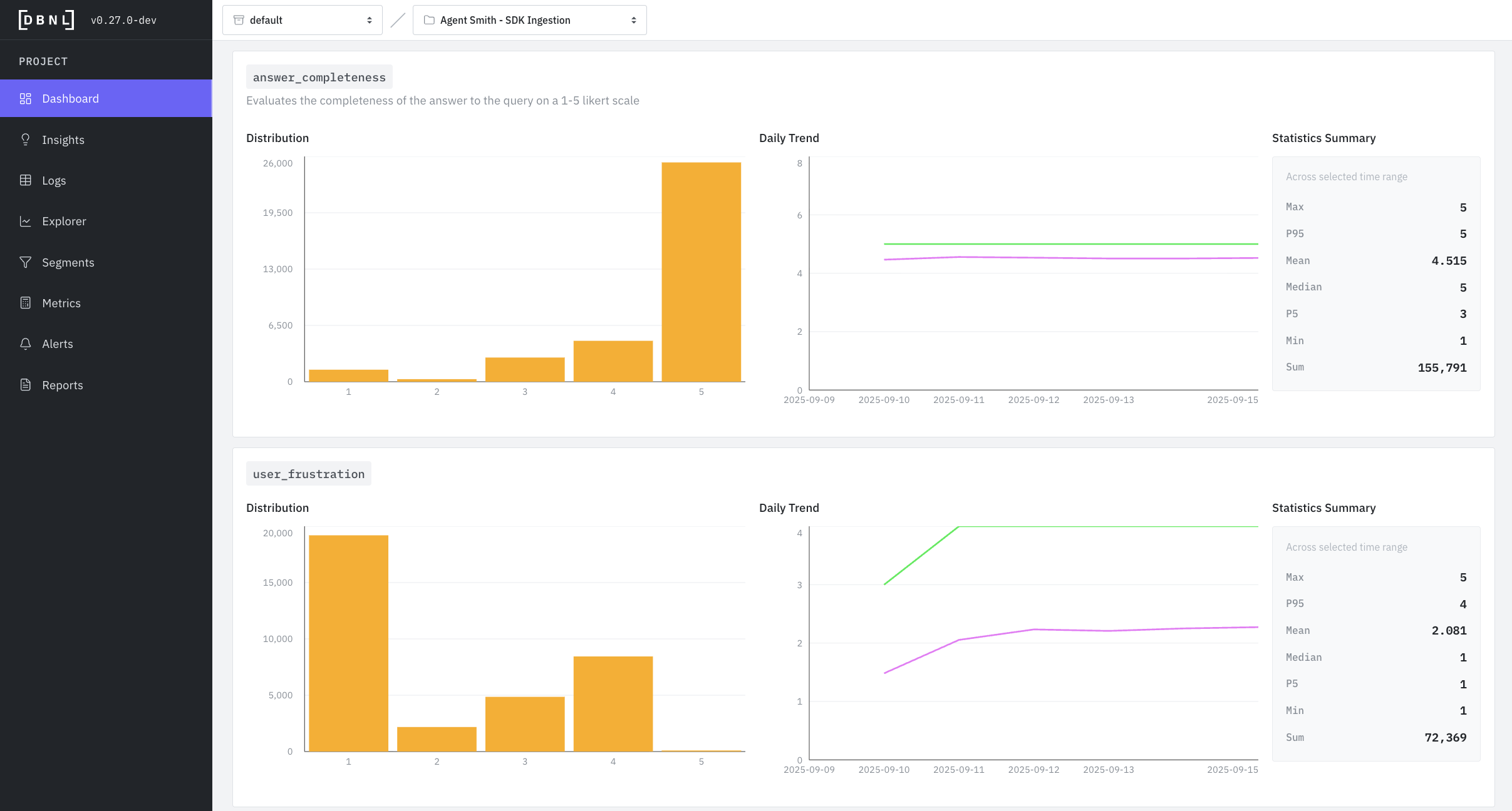
Metrics Dashboard: Histograms, time series and statistics of generated Metrics
Monitoring Dashboard

Segments Dashboard

Metrics Dashboard

Interpreting Dashboard Visualizations
When investigating an issue, start with the time series to identify when it started, then use the histogram to understand what values are problematic, and finally check the logs page to see which specific logs exhibit the behavior.
Reading Sankey Charts (Tool Call Graph)
Sankey charts show how agentic tool calls chain together in a trace:
Nodes: Boxes representing specific tool calls (ie
llm:gpt-4o-mini,tool:web_search, etc)Flows: Bands connecting nodes - width represents volume/quantity
Direction: Left-to-right shows progression through tool calls
Patterns to Watch For
Dominant path: The thickest flow shows the most common path, when displaying by error count rate this is the path that proportionally has the most errors
Repeated nodes: Calling the same tool many times may represent unwanted behavior
Unexpected routes: Thin flows to unusual destinations may reveal edge cases
Distribution imbalance: When splits are very uneven, investigate why
Example: A Sankey chart with many repeated nodes represents tool calls failing or needing to be retried many times, which may indicate an underlying bug in the agent or context.
Reading Histograms (Distribution)
Histograms show how frequently different values occur:
X-axis: The metric value (e.g., token count, score from 1-5)
Y-axis: Number of logs with that value
Shape insights:
Normal (bell curve): Most values cluster around the average - typical, healthy distribution
Bimodal (two peaks): Two distinct behaviors - investigate what causes the split
Skewed left/right: Most values on one side - may indicate a problem or constraint
Flat: Wide spread of values - inconsistent behavior worth investigating
Example: A token count histogram with two peaks (at 100 and 500 tokens) suggests two distinct conversation types.
Reading Time Series (Daily Trend)
Time series show how values change over time:
X-axis: Date
Y-axis: Metric value
Lines: Typically shows average (mean) and P95 (95th percentile)
Patterns to watch for:
Sudden spikes: Indicates an incident or change - investigate the date
Gradual increases: May indicate growing problem or changing user behavior
Sudden drops: Could be a fix, or loss of traffic/functionality
Flat line: Stable behavior - good for established metrics
Diverging P95 and mean: Growing variance - some logs behaving very differently
Example: User frustration P95 suddenly spiking while mean stays flat suggests a subset of users are becoming frustrated.
Using Statistics Summary
Statistics give you quick numerical insights:
Compare Max vs P95: If very different, you have extreme outliers worth investigating
Compare Mean vs Median: If very different, your data is skewed (not normally distributed)
Track P95 over P99: P95 is more stable and actionable for most use cases
Use Min/Max: Identify best and worst case examples to investigate
Was this helpful?