# Dashboards

Dashboards are collections of histograms, time series and statistics of monitored [Columns](https://docs.dbnl.com/v0.27.x/configuration/data-pipeline#columns), tracked [Segments](https://docs.dbnl.com/v0.27.x/workflow/segments), and generated [Metrics](https://docs.dbnl.com/v0.27.x/workflow/metrics) for user-driven analysis.

There are three default dashboards for each [Project](https://docs.dbnl.com/v0.27.x/workflow/projects):

* [**Monitoring Dashboard**](#monitoring-dashboard): Distributional recommended graphs and statistics built from required [Columns](https://docs.dbnl.com/v0.27.x/configuration/data-pipeline#columns) and data from the [DBNL Semantic Convention](https://docs.dbnl.com/v0.27.x/configuration/dbnl-semantic-convention)
* [**Agent Dashboard**](#agent-dashboard): Directed graph of all agent tool calls as a Sankey chart to allow for rapid exploration of tool call chains.
* [**Segments Dashboard**](#segments-dashboard): Count graphs and statistics for all tracked [Segments](https://docs.dbnl.com/v0.27.x/workflow/segments)
* [**Metrics Dashboard**](#metrics-dashboard): Histograms, time series and statistics of generated [Metrics](https://docs.dbnl.com/v0.27.x/workflow/metrics)

### Monitoring Dashboard

<figure><img src="https://content.gitbook.com/content/8N8zzLtIch6ZiTSwWtXD/blobs/JrewjIVBy4t1kwFAiETV/DBNL-dashboard-monitor.png" alt=""><figcaption><p>
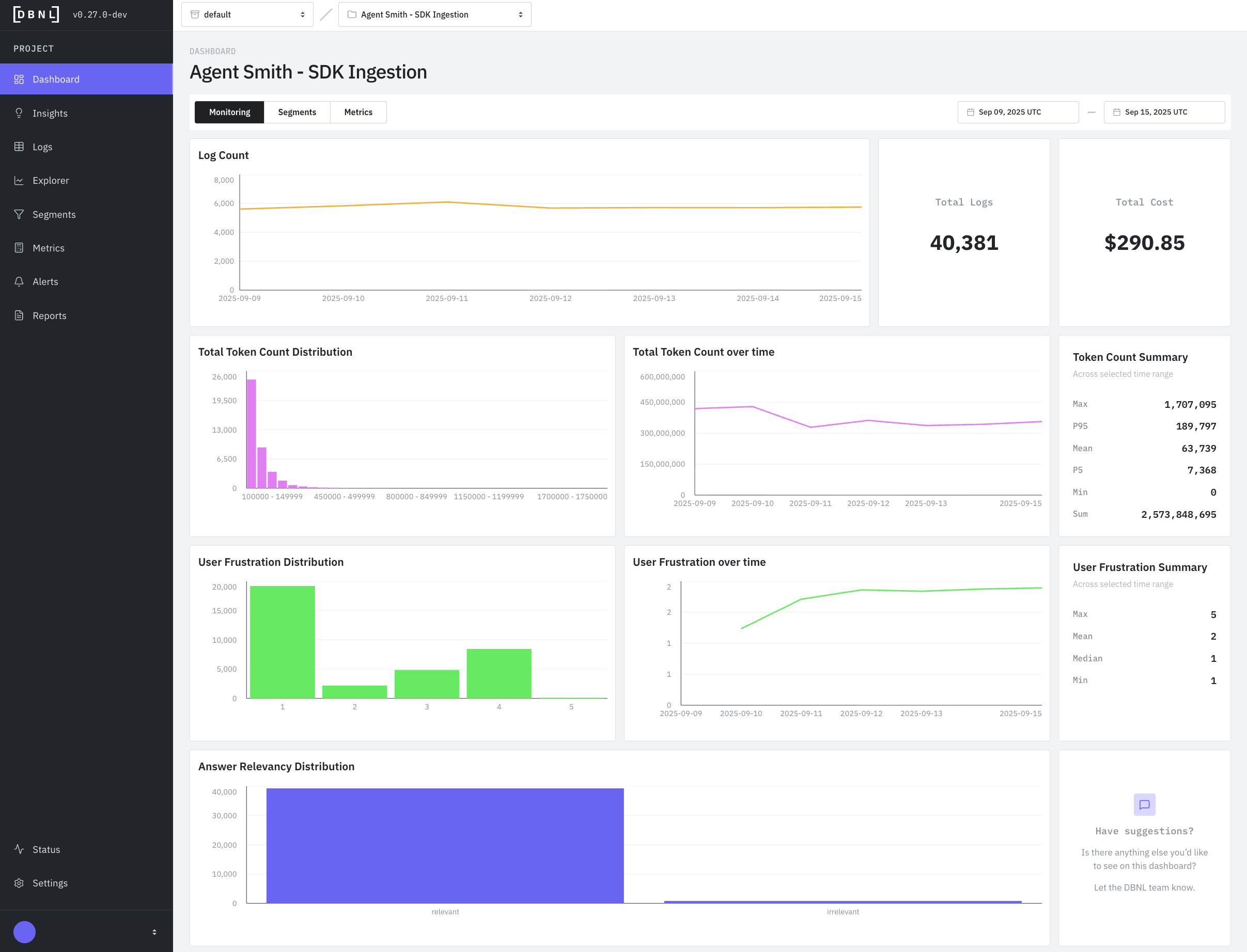
Default dashboard displaying recommended graphs and statistics for a specific time window (default: last 7 days)</p></figcaption></figure>

### Agent Dashboard

<figure><img src="https://content.gitbook.com/content/8N8zzLtIch6ZiTSwWtXD/blobs/2rapVH6In4rRS3aolbon/DBNL-dashboards-agent.png" alt=""><figcaption><p>
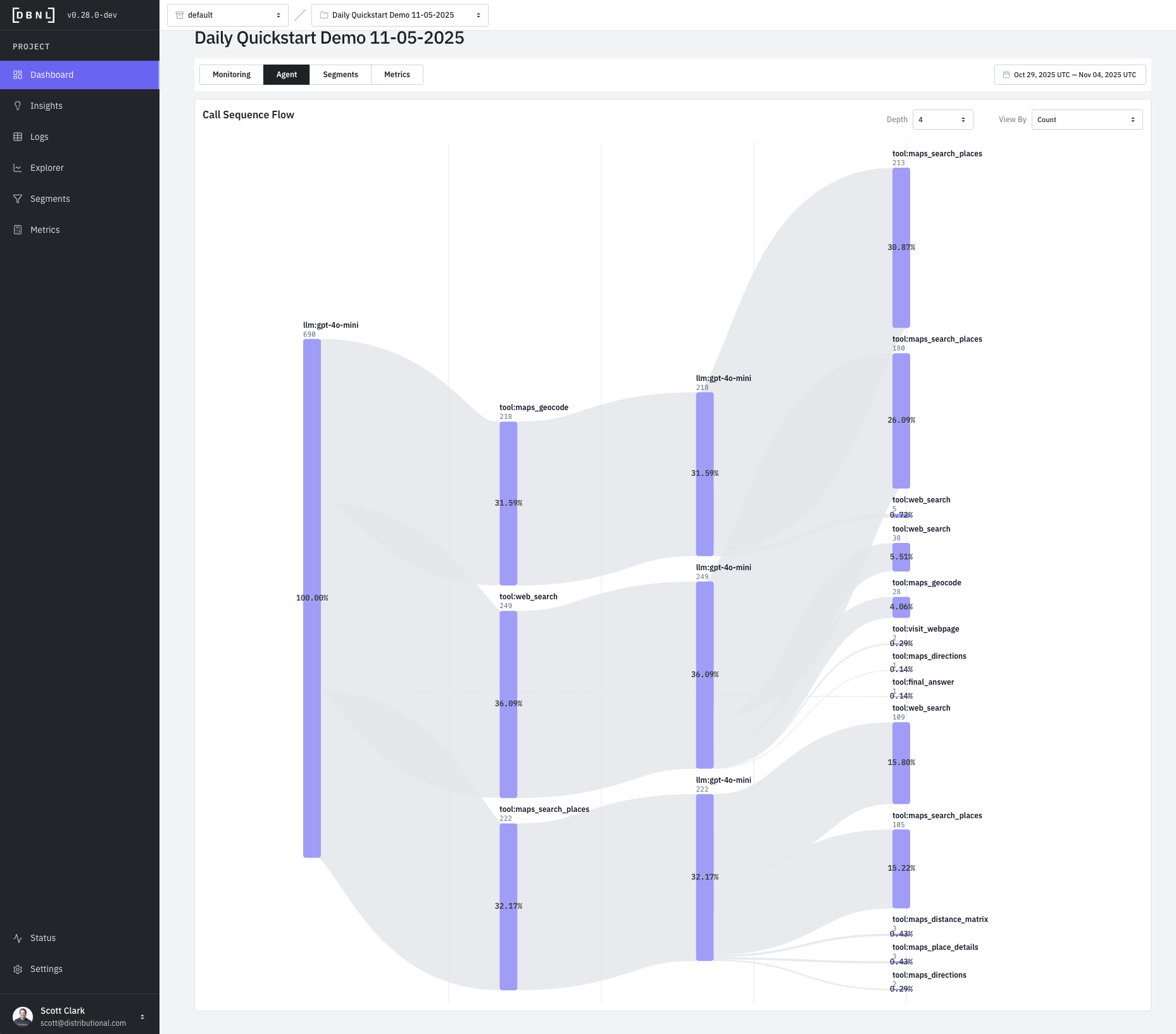
Agent tool call graph showing the directed graph of tool calls as a Sankey chart for all data within the time window (default: last 7 days)</p></figcaption></figure>

### Segments Dashboard

<figure><img src="https://content.gitbook.com/content/8N8zzLtIch6ZiTSwWtXD/blobs/oSUjsrKjb8z7YELhahBK/DBNL-dashboard-segments.png" alt=""><figcaption><p>
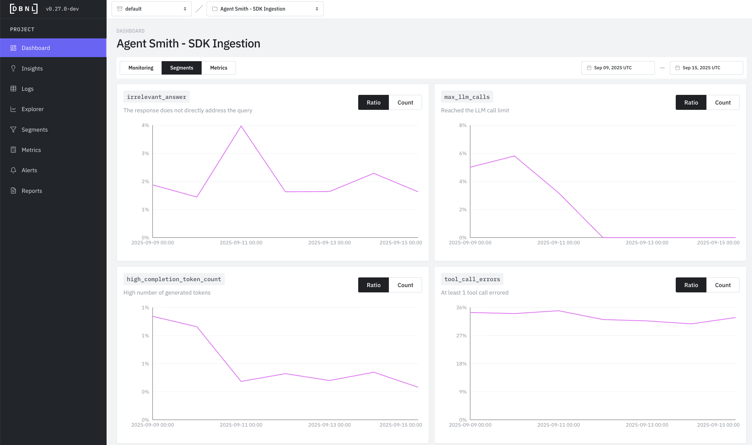
Dashboard displaying all tracked [Segments](segments.md) as time series of daily counts for each [Segment](segments.md) within a specific time range (default: last 7 days)</p></figcaption></figure>

### Metrics Dashboard

<figure><img src="https://content.gitbook.com/content/8N8zzLtIch6ZiTSwWtXD/blobs/N8x2mdY1ctFg3TEUbjYY/DBNL-dashboard-metrics.png" alt=""><figcaption><p>
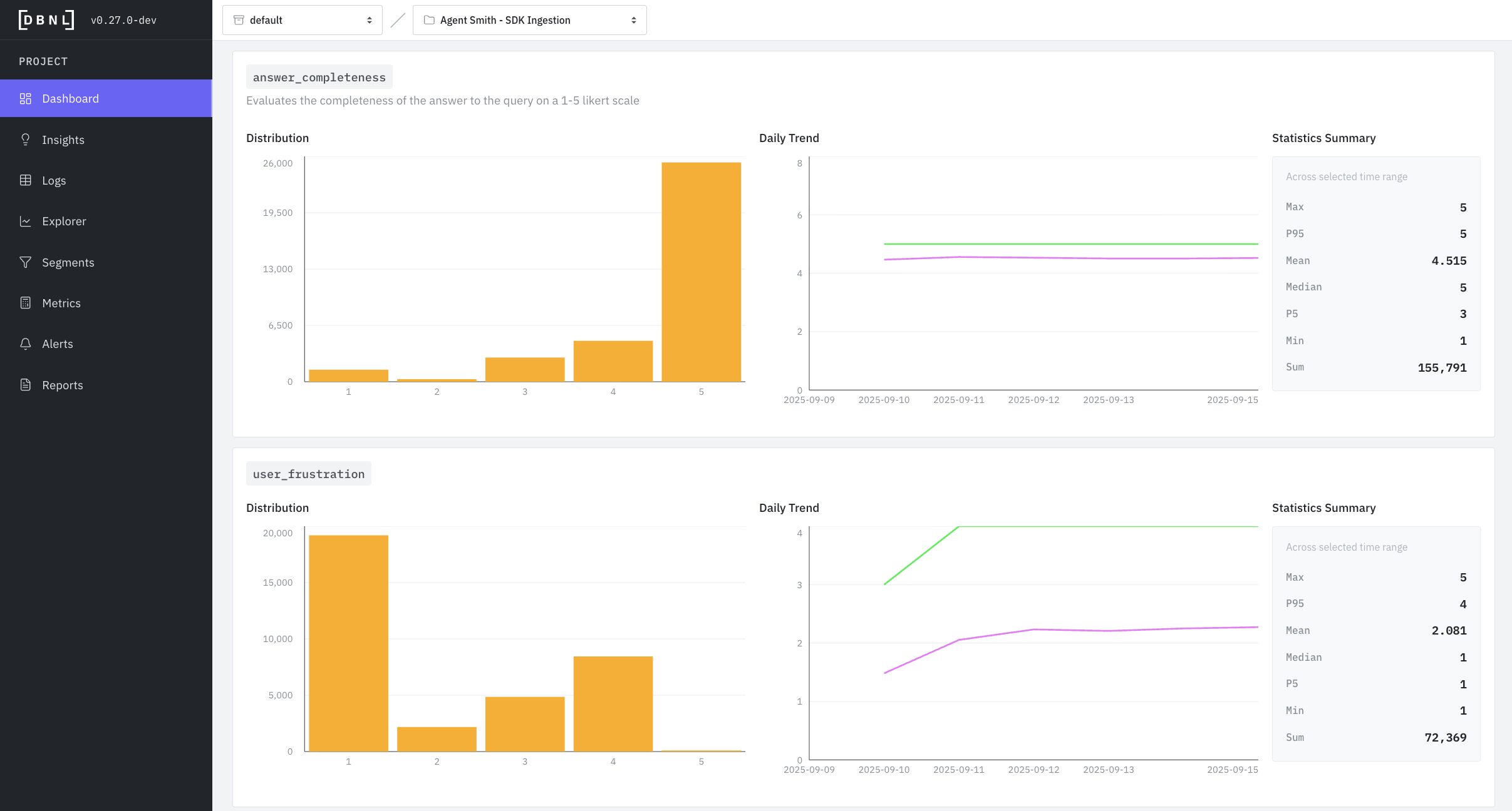
Dashboard displaying all custom [Metrics](metrics.md) as histograms, time series, and statistics summaries for all logs within a specific time range (default: last 7 days)</p></figcaption></figure>

## Interpreting Dashboard Visualizations

When investigating an issue, start with the time series to identify **when** it started, then use the histogram to understand **what values** are problematic, and finally check the logs page to see **which specific logs** exhibit the behavior.

### Reading Sankey Charts (Tool Call Graph)

Sankey charts show **how agentic tool calls chain together** in a trace:

* **Nodes**: Boxes representing specific tool calls (ie `llm:gpt-4o-mini`, `tool:web_search`, etc)
* **Flows**: Bands connecting nodes - width represents volume/quantity
* **Direction**: Left-to-right shows progression through tool calls
* **Patterns to Watch For**
  * **Dominant path**: The thickest flow shows the most common path, when displaying by error count rate this is the path that proportionally has the most errors
  * **Repeated nodes:** Calling the same tool many times may represent unwanted behavior
  * **Unexpected routes**: Thin flows to unusual destinations may reveal edge cases
  * **Distribution imbalance**: When splits are very uneven, investigate why

**Example**: A Sankey chart with many repeated nodes represents tool calls failing or needing to be retried many times, which may indicate an underlying bug in the agent or context.

### Reading Histograms (Distribution)

Histograms show **how frequently** different values occur:

* **X-axis**: The metric value (e.g., token count, score from 1-5)
* **Y-axis**: Number of logs with that value
* **Shape insights**:
  * **Normal (bell curve)**: Most values cluster around the average - typical, healthy distribution
  * **Bimodal (two peaks)**: Two distinct behaviors - investigate what causes the split
  * **Skewed left/right**: Most values on one side - may indicate a problem or constraint
  * **Flat**: Wide spread of values - inconsistent behavior worth investigating

**Example**: A token count histogram with two peaks (at 100 and 500 tokens) suggests two distinct conversation types.

### Reading Time Series (Daily Trend)

Time series show **how values change over time**:

* **X-axis**: Date
* **Y-axis**: Metric value
* **Lines**: Typically shows average (mean) and P95 (95th percentile)
* **Patterns to watch for**:
  * **Sudden spikes**: Indicates an incident or change - investigate the date
  * **Gradual increases**: May indicate growing problem or changing user behavior
  * **Sudden drops**: Could be a fix, or loss of traffic/functionality
  * **Flat line**: Stable behavior - good for established metrics
  * **Diverging P95 and mean**: Growing variance - some logs behaving very differently

**Example**: User frustration P95 suddenly spiking while mean stays flat suggests a subset of users are becoming frustrated.

### Using Statistics Summary

Statistics give you **quick numerical insights**:

* **Compare Max vs P95**: If very different, you have extreme outliers worth investigating
* **Compare Mean vs Median**: If very different, your data is skewed (not normally distributed)
* **Track P95 over P99**: P95 is more stable and actionable for most use cases
* **Use Min/Max**: Identify best and worst case examples to investigate

{% hint style="info" %}
**Understanding Percentiles**: A percentile indicates the value below which a given percentage of observations fall. For example:

* **P95 (95th percentile)**: 95% of values are below this number. Useful for understanding worst-case scenarios while ignoring extreme outliers.
* **P5 (5th percentile)**: Only 5% of values are below this number. Useful for understanding best-case scenarios.
* **Median (P50)**: The middle value - half are above, half are below.

Percentiles are more reliable than averages when data has outliers or skewed distributions.
{% endhint %}
